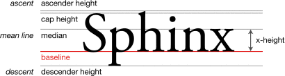
In typography, the mean line is the imaginary line at the top of the x-height.[1]
Round glyphs will break (overshoot) the mean line slightly in many typefaces, since this is aesthetically more pleasing; a rounded shape will appear visually smaller than flat-topped (or bottomed) shapes of equal height, due to an optical illusion
References
- ^ Felici, James (2011). The Complete Manual of Typography: A Guide to Setting Perfect Type, Second Edition. Adobe Press. p. 315. ISBN 0-321-77326-8.
External links
This article is copied from an
article on Wikipedia® - the free encyclopedia created and edited by its online user community. The text was not checked or edited by anyone on our staff. Although the vast majority of Wikipedia® encyclopedia articles provide accurate and timely information, please do not assume the accuracy of any particular article. This article is distributed under the terms of
GNU Free Documentation License.
All content on this website, including dictionary, thesaurus, literature, geography, and other reference data is for informational purposes only. This information should not be considered complete, up to date, and is not intended to be used in place of a visit, consultation, or advice of a legal, medical, or any other professional.