)
Gothic typefaces (simplified Chinese: 黑体; traditional Chinese: 黑體; pinyin: hēitǐ; Japanese: ゴシック体 goshikku-tai; Korean: 돋움 dotum, 고딕체 godik-che) are a type style characterized by strokes of even thickness and lack of decorations akin to sans serif styles in Western typography. It is the second most commonly used style in East Asian typography, after Ming.
Characteristics
Similar to Ming and Song typefaces, sans-serif typefaces were designed for printing, but they were also designed for legibility. They are commonly used in headlines, signs, and video applications.
Classifications
- Square sans (Japanese: 角ゴシック kaku goshikku; simplified Chinese: 方体; traditional Chinese: 方體; pinyin: fāngtǐ), the classic sans-serif style in which the lines of the characters have squared ends.
- Overlapping square sans (simplified Chinese: 叠黑体; traditional Chinese: 疊黑體; pinyin: diéhēitǐ) - This style is similar to the square sans, but in places where strokes overlap, a margin is inserted between the strokes to distinguish the strokes.
- Square new book (simplified Chinese: 方新书体; traditional Chinese: 方新書體; pinyin: fāngxīn shūtǐ) - Uses narrow horizontal and thick vertical strokes, similar to typefaces such as Optima.
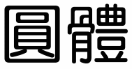
- Round sans (Japanese: 丸ゴシック maru goshikku, simplified Chinese: 圆体/黑圆体; traditional Chinese: 圓體/黑圓體; pinyin: yuántǐ/hēiyuántǐ, Korean:굴림체 gullimche), has rounded ends and corners to the lines of the characters. In some cases, short protruding stroke ends at intersections are eliminated to make glyphs look rounder. This is the style of typeface used for Japanese road signs.
- Overlapping round sans (simplified Chinese: 叠圆体; traditional Chinese: 疊圓體; pinyin: diéyuántǐ) - This is similar to the round sans, but in places where strokes overlap, a margin is inserted between the strokes to distinguish the strokes.
- Rounded new book (simplified Chinese: 圆新书体; traditional Chinese: 圓新書體; pinyin: yuánxīn shūtǐ) - Uses narrow horizontal and thick vertical strokes, along with rounded line ends and corners.
- Mixed art (simplified Chinese: 综艺体; traditional Chinese: 綜藝體; pinyin: zōngyìtǐ) - Curved strokes are replaced by angled strokes with sharp or round corners.
Sans-serif typefaces in computing
Sans serif typefaces, especially for default system fonts, are common in Japanese computing. Also, many Korean computing environments use Gulim which includes soft curves but is a sans-serif typeface.
In Chinese versions of Microsoft Windows XP and older, the default interface typefaces are seriffed (MingLiU and SimSun), which deviates from the sans serif styling use in most other (including East Asian) regions of the product. Starting in Windows Vista, the default interface typefaces in all regions were changed to sans-serif styles, using Microsoft JhengHei in Traditional Chinese environments and Microsoft YaHei in Simplified Chinese environments.